⚡ Tl;dr
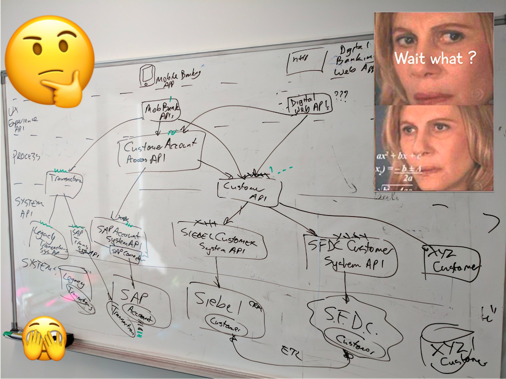
- Diagrams are the bread and butter of explaining how software systems work to many architects and engineers. Unfortunately, they are usually hard to read and understand due to a few surprisingly simple mistakes.
- By fixing these common mistakes, you can make your diagrams useful to the people they are intended for and help the team move faster.
🚀 Let’s kick-off
Software architecture diagrams are one of the most important tools for explaining complex systems to the people we work with. Diagrams are powerful when done right; however, they often lack information and cause confusion for the viewer. The experience of the reader is something that’s often overlooked when drawing these software architecture diagrams.
Let’s go through the top mistakes in software architecture diagrams so we can make sure to avoid them.
1️⃣ Lines that are not labelled
What do the lines between your objects represent? Lines often lack labels, and we hear a lot of “it’s obvious what that means,” which unfortunately isn’t true. An unlabeled line is ambiguous, especially without an arrowhead to show the direction. Are you showing a message being sent between objects? Is the line showing that one object is dependent on another? Is one object sending a message to the other? If applicable, what technology choice has been made to send that message? Adding a label to all lines and connections removes this ambiguity.

2️⃣ Colours and shapes without a key or legend
Colour is a great way to show extra information on diagrams, but there are a few common mistakes we see here. We frequently see diagrams with no key or legend to explain each colour’s meaning. This is super confusing to someone who has just landed on your diagram for the first time and hasn’t been told the secret code. It’s also extra confusing when diagrams distributed around the team have conflicting meanings for the red colour. Adding a legend will help your audience understand your colours.
Notation in diagrams may include shapes, symbols and arrowheads. Shapes and symbols are useful to explain what type of object things represent. If you use UML or another standard notation, adding and explaining these shapes in a key means your audience doesn’t have to hunt down the meaning in a complex spec themselves.
3️⃣ Line styles and arrowheads without a key
Along with adding labels on the lines discussed above, it’s important to explain your line styling and arrowhead choices. For example, what does it mean if you’re using a dotted line vs a solid line? What do solid arrowheads vs angled arrowheads represent? Explaining your choice of styling and adding them to your key or legend helps your audience understand what each of the styles represents.

4️⃣ Icons with no name or label
Icons are great at giving more detail about what you’re diagramming, such as what technology you’re using, is this object a database etc. However, your audience isn’t all going to know all the icons you’re using. Missing some explanation will lead to guesswork, slowing you and your team down later on when those assumptions are wrong or questioned. This problem is especially relevant with all cloud services and icon packs expanding; adding names to the icons directly or within a key/legend helps your whole team.
![]()
5️⃣ Diagrams with no title or description
It’s easy to assume that everyone knows what you’ve diagrammed, but it’s often not fully understood and requires a navigator (someone to explain the diagram) or questions to be answered first. In the same way that art comes with a title to guide what spectators are looking at, adding a title and brief description to your diagrams gives your audience an overview of what they’re looking at.

6️⃣ No last updated data and author
Diagrams are often time-sensitive in that they apply at a given point in time, whether a representation of a current design or future design. Adding a date to your diagrams gives your audience an understanding of when this diagram was applicable. Diagrams are usually built by an individual or group of subject matter experts at a point in time. Adding the author somewhere on the diagram can help people know who to talk to if something is missing, incorrect, or uncertain. Adding a date and author gives your teammates or people within the company an idea of how “trustworthy” your diagram is.

🏁 To wrap up
Whether on a whiteboard or using a tool, diagrams are great at visually explaining complex topics, which is why they’re so common in software engineering. Though they’re powerful, it’s easy to forget that the audience of these diagrams has less context than you do, so doing the work for them (adding labels, titles, a key etc.) helps them understand your visuals much easier. Fixing these common mistakes will help your team move faster and more efficiently.
Stay chill 🧊
